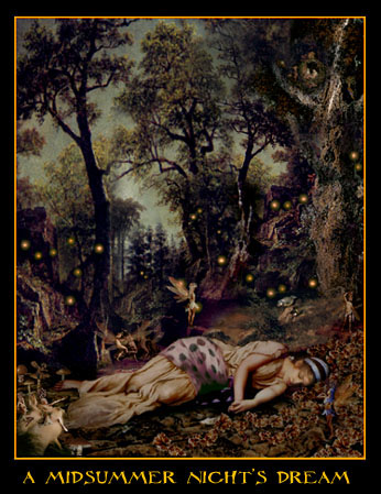
The book cover that I think is most effective is the last
one. I think that this book cover seems traditional. All of the other covers seem too childish and
cartoony. I feel that it is good to keep
the ancient feel and not make the pictures look like children could have drawn
it. I like the way the illustrator added
the balls of light everywhere as it draws the reader’s eye to the cover. I think that the softness of the drawing is
what makes it seem real. Instead of
using cartoon people which could make the book seem like it is for
children. I picked this book cover
because of all of the details that are put into it.
You can see everything from the creases in Hermia’s dress to the fairies
wings. Whereas on the other covers you
only see the silhouettes or the drawing had very little detail put into it. I feel
that the detail even in the trees would lure young adults to this book. It is a very beautiful drawing and can be a
reference to the book. The book cover
shows a woman sleeping during a summer night and the books title is A Midsummer Night’s Dream this can kind
of show the reader what they may be reading about.
It will also show the setting of the book. In the book they spend most of their time in
the woods and that is what the hole cover is.
The reader can make reference to the picture and see that it is an older
book. The cover has somewhat of an
old feel to it which is exactly the time frame the book is in. The cover could lure people to it and also
push people away because of the ancient feel.
I feel the illustrator did a great job when designing the cover and i feel it
was a great choice to make it extra detailed.
I agree with you on the cover, I also really like it too, and I think the details are really nice.
ReplyDelete